
Final Project Musing
FIVE THINGS I LEARNED
1.I've learned to let go of ego and to truly support the design's message instead of my own musings.
2.It's important to make meaningful decisions when setting up typographic guidleines. What kind of grid will the design have, what fonts will connect to my audience, and where will visual heirarchy enhance understanding?
3.Strong concepts swings the audiances attention to the message. But it's important to make unified concept choices. If the concept whole the design will die.
4.It's important to have good flow, so much so, that the readers could kayak through the design. The eyes should naturally glide over the page, like water flowing through a river.
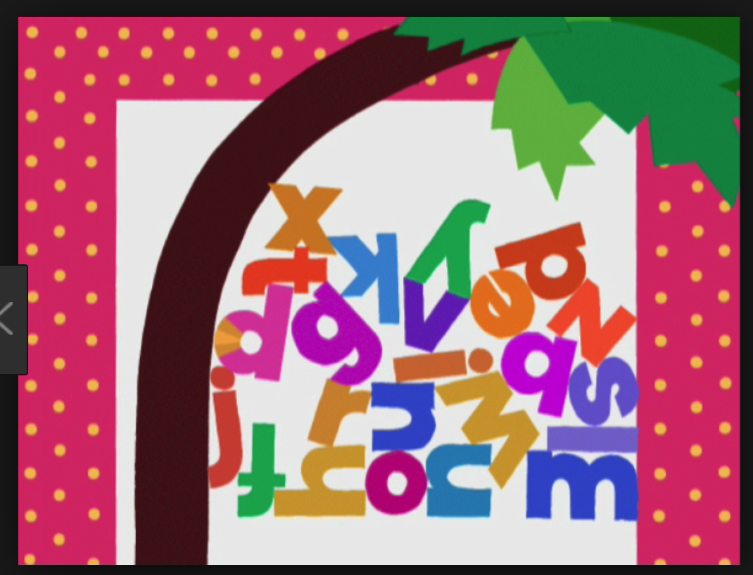
5.Good typogrphic skills dont nessisarily need to be suplimented with the use of image. The type can be the most interesting part of the design.
JENNYANN
1.Type is absolutley vast and very complex. Type has a multidue of classifications which covey different moods and meanings.
2.Every font has a classification that comunicates differently.
3.Type systems bring are meant to bring visuall relation to different design componenets.
4. Layout can be expressive when information is legible.
5. The best logotype characteristsics are found through dedicated experimentation.
SAMMY
1.Classical layouts have centered type and serif typefaces.
2.Modern layouts avoid centered type and pirmarily use left justified layouts with the use sans serif typefaces.
3.Black type is most legible on white backgrounds.
4.Serif fonts are composed of more specified chracteristics.
5.Early typefaces were inspired by hand written forms.
Delaney
1."Typogrpahy is an art." Designers must connect to their artistic side to fully express type to it's full potential. "Good typogrpahy is art." - Paul Rand
2.Counters in an e are called an 'eye'.
3.Typefaces are based on their origins and characteristsics.
4.It's imparative to understand typogrpahy rules.
5.Typogrpahy is the use of type to advocate messages.
Brenana
1.Consistent layout placments bring visual syntax to readers and intensified understanding.
2.Alternating colors in a publication creates a visual rythm.
3.There are different kinds of grid systems.
4.Typography is 2D architechture.
5.Somtimes is worth breaking typeogrpahic rules to inscrease visual expression.


Subscribe to:
Comments (Atom)